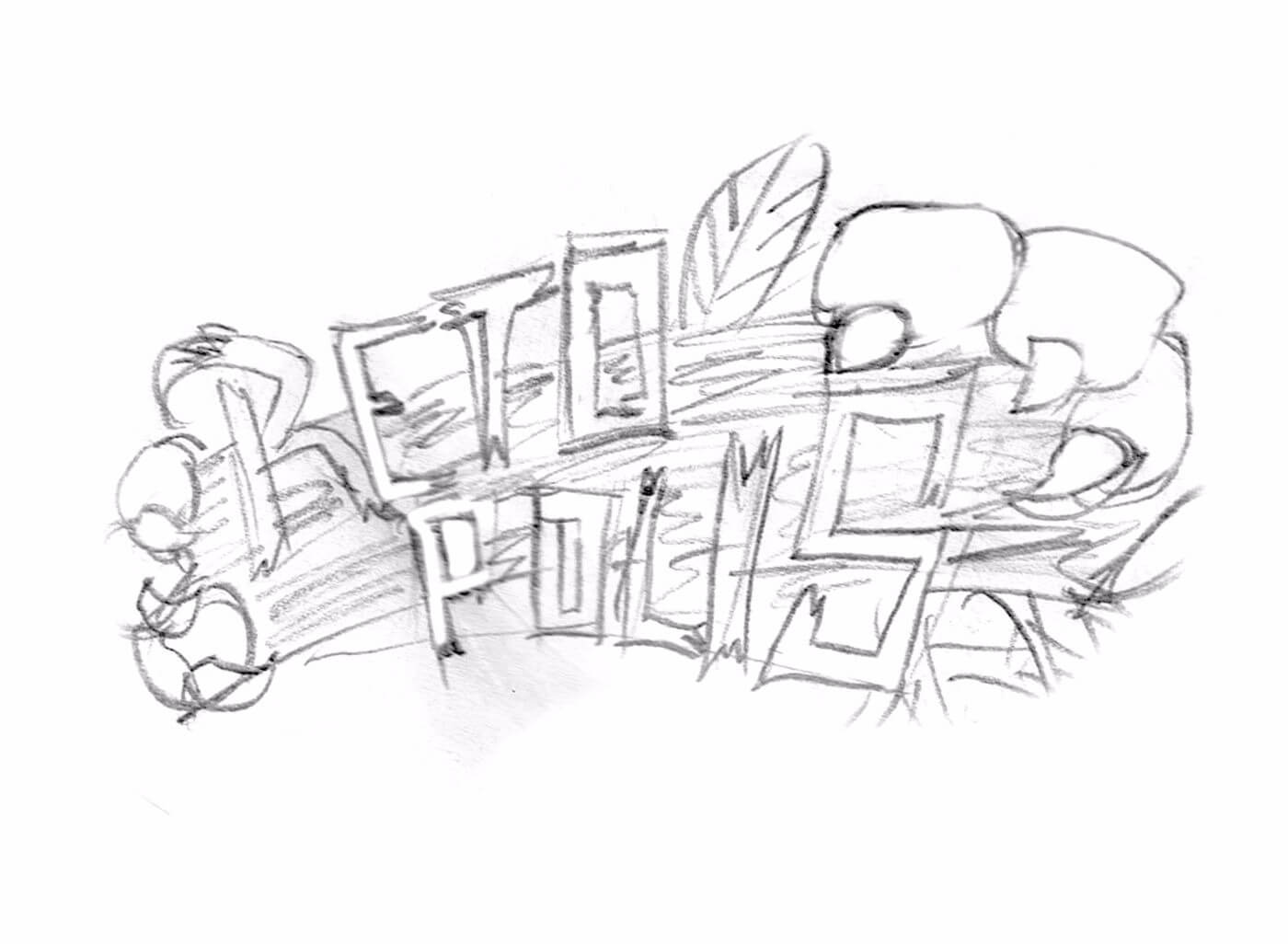
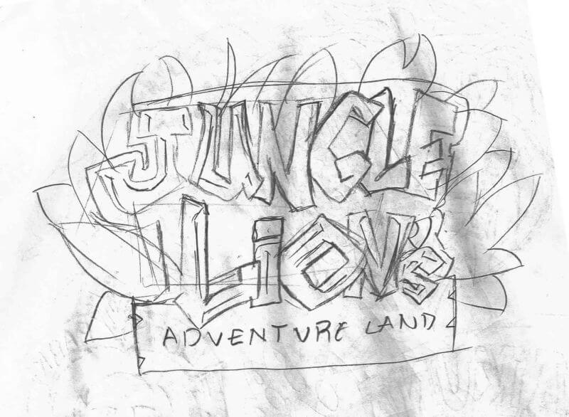
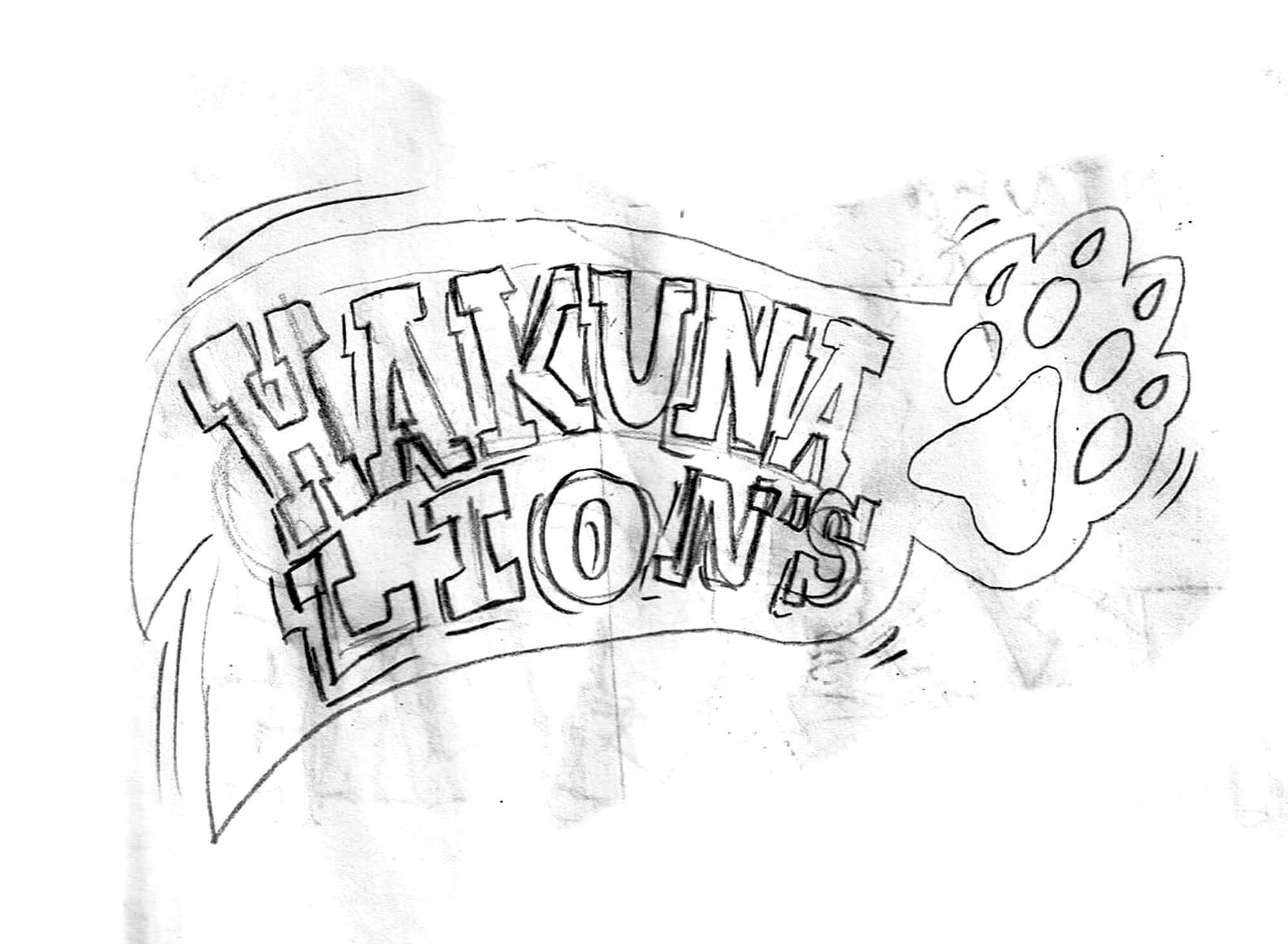
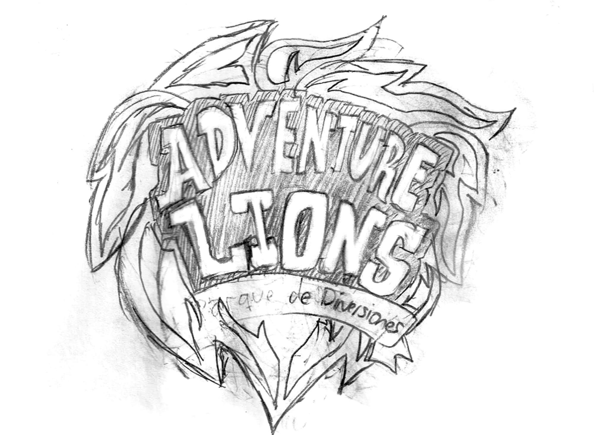
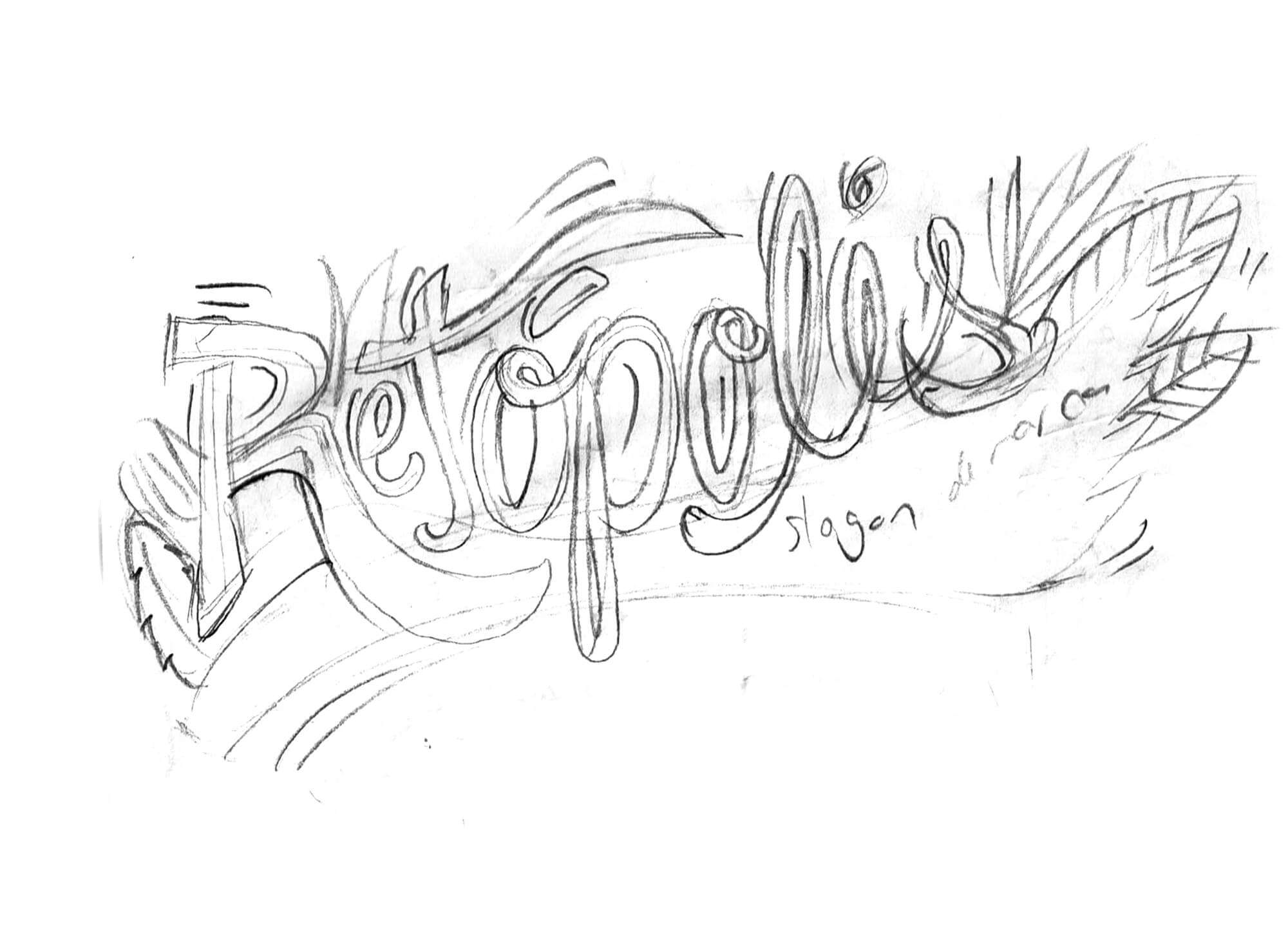
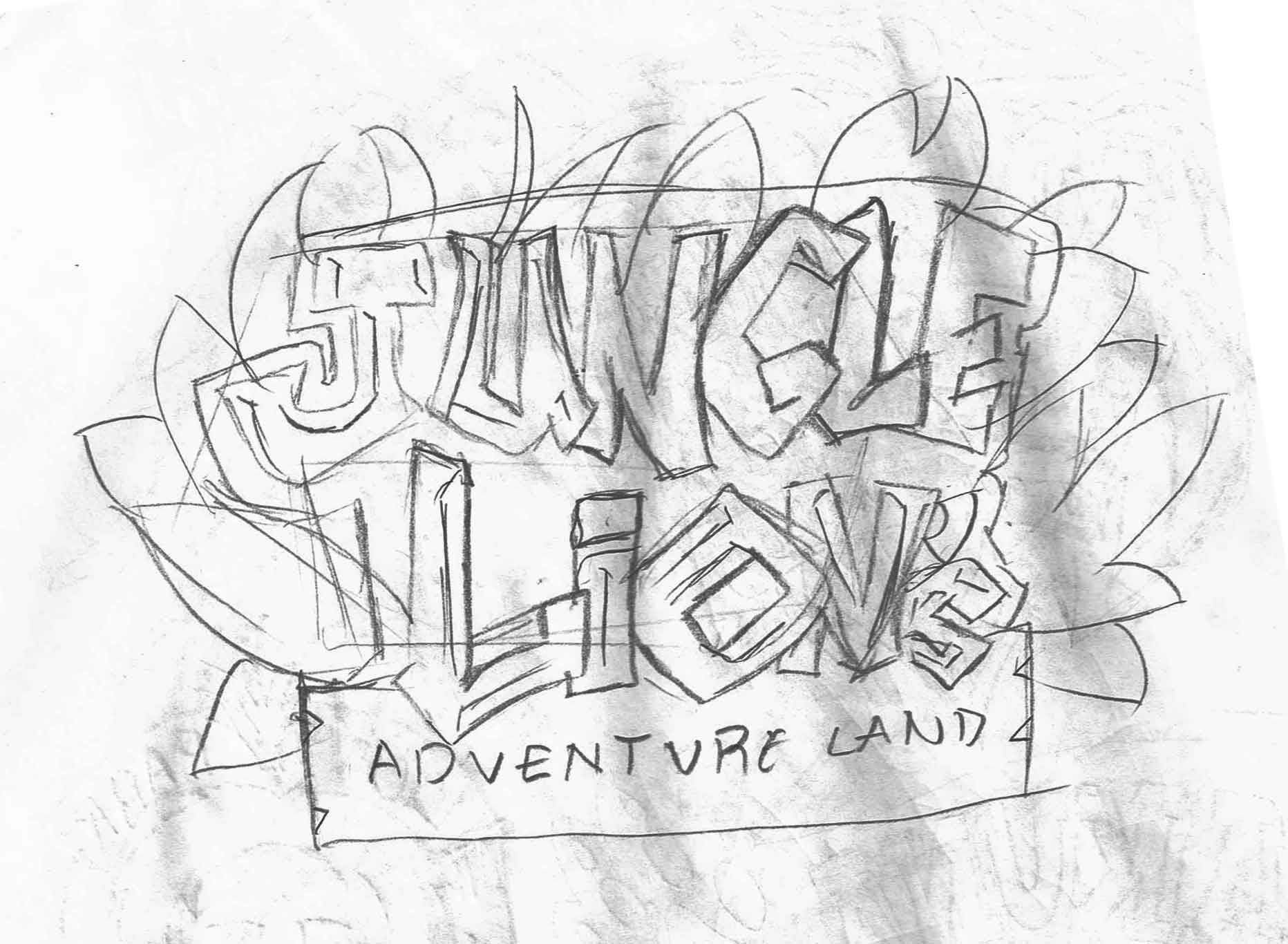
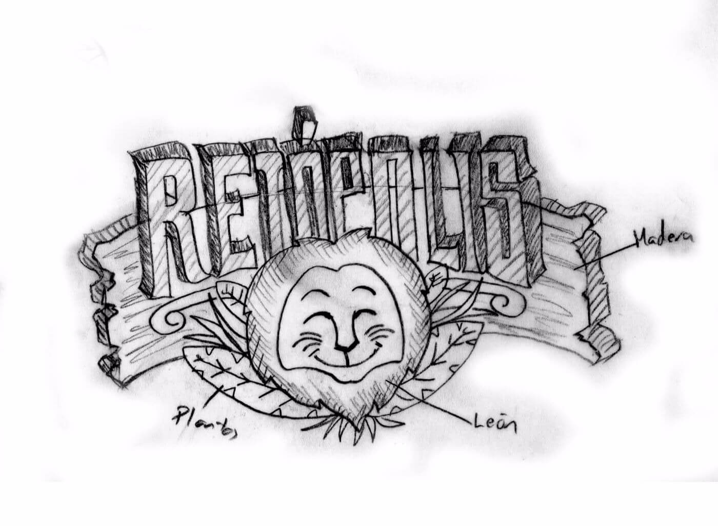
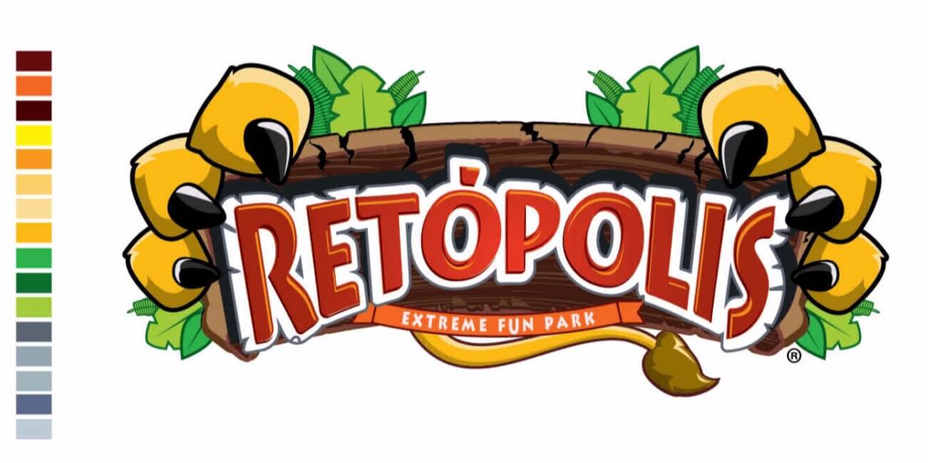
website design templates

Retópolis - Family Fun Park
(Visual design and branding management)

The project

Recreational and fun park's for children with party themes and a whole family experience is a must in a city where people look after places to invest on their bonding. Thats the focus and starting point Retópolis took as flag.

This was a project brought through a series of personal coincidences where i found myslef interested in bringuing value to the duty since the first moment. The graphic and visual potential to develop into this line of client was a complete -yes-.

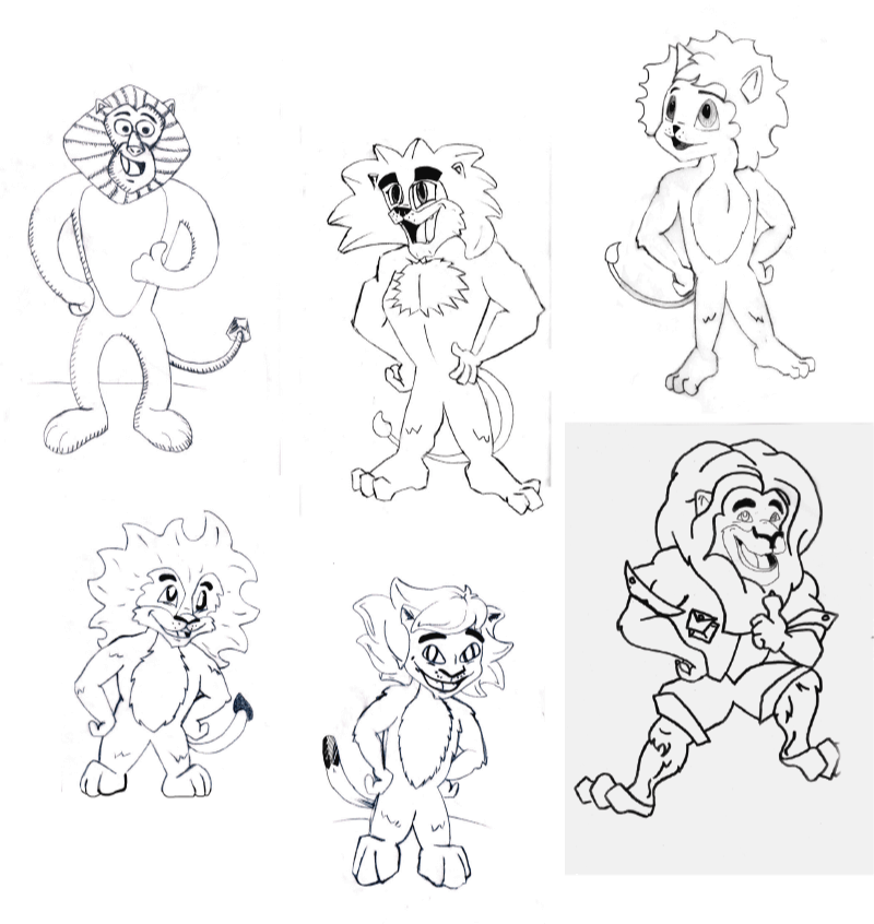
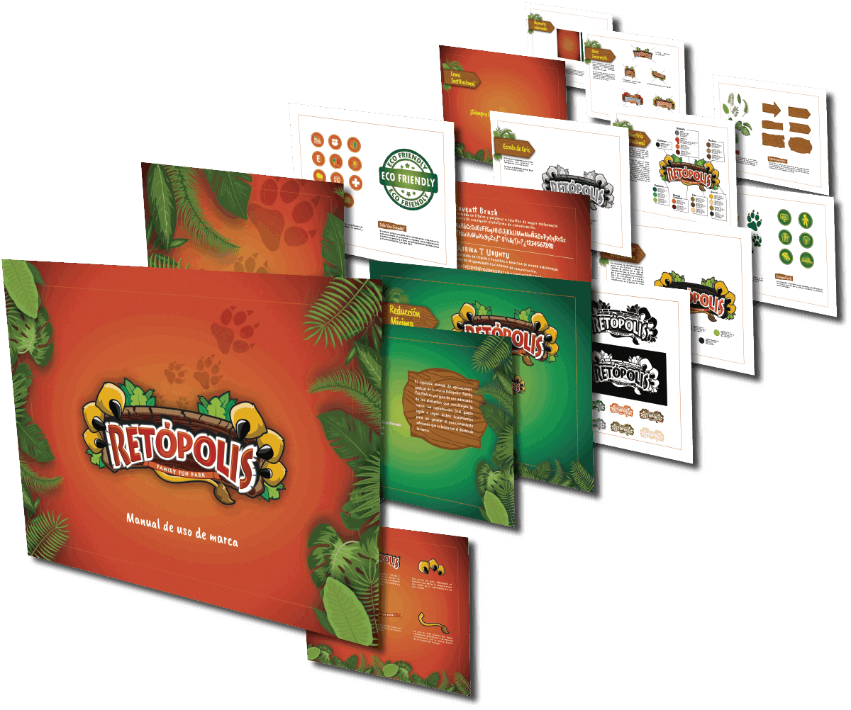
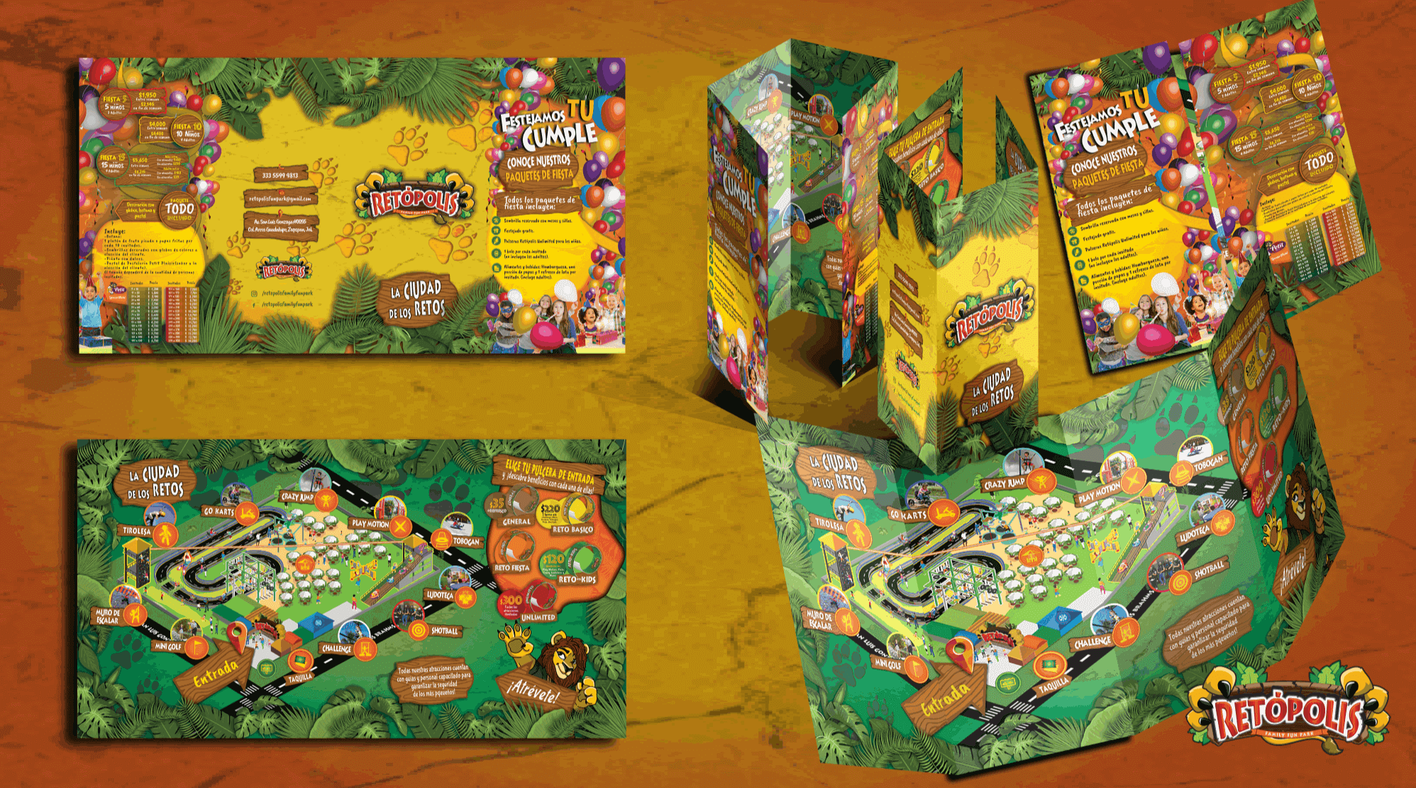
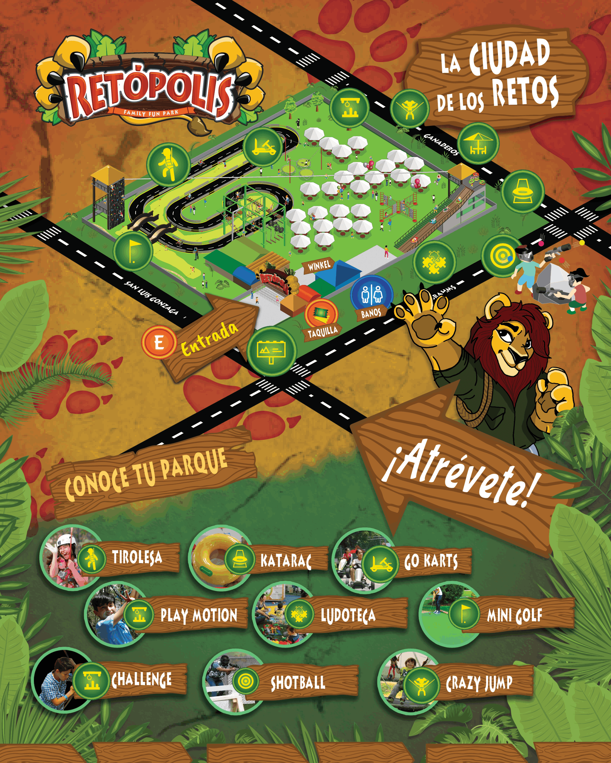
Then, the initial sketching for the brand and subsequent aplications began.

Naming and concept

The concept was clear at the start: it had to include a lion, a jungle, fun typhographic management and a colorful display that ensured the complete experience. Direct competition in this comertial sector has some assets that may be explored and analyzed for this project to have its own identity and exposure to the new market. Since the park was to be located inside the Guadalajara metropolitan zone (not an usual place, to be honest), people would gain interest beacause of factors such as the time to arrive.

The final naming solution

"Retópolis - Family fun Park" was the name given to the final brand after some research and the availability shown inside the brand property and registration instances.

After adjustments and many style corrections, this was designated as the final logo design.

The lion paw+claws grabing the name sign, displaying scratches and jungle flora, along the tag slogan made it a complete client satisfaction work.

The Mascot

The brand included lion escense within, but it needed an extra representation about this feature. So it was decided to include a mascot as the face of the brand. It had to include some features tha directly refered to a masculine, strong, kind and secure character that brings trust and empathy for children. 

It was a really nice output of styles invested into finding the adequate one to portray all of the previous traits.

Finally, the client decided to push over another designer to complete the task and delivered a character for the clients own taste.

Brand book

Once it was defined, the brand required a complete visual guide for the correct usage of itself, so the development of the identity document was to be delivered.

Finally, here are some rendered applications for the brand 

Unfortunatly, the whole project is at a current hiatus state, due to the pandemic situation, the main investors withdraw from the development. Hopefully, it will continue on its delivery in the future.