Overlook
As seen in the branding review about ProyectAcero, the whole concept and approach of the brand is to implement a "crystal clear" and clean and neat view on the whole interface to design.

As seen in the branding review about ProyectAcero, the whole concept and approach of the brand is to implement a "crystal clear" and clean and neat view on the whole interface to design.
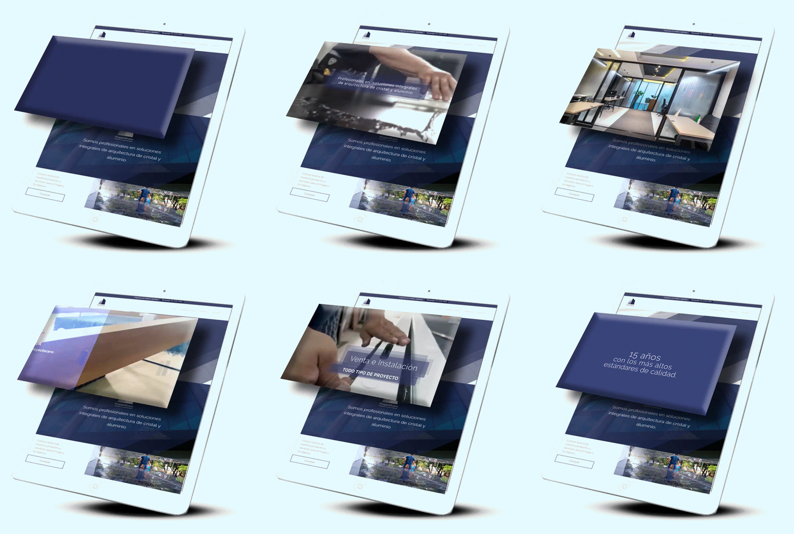
When developing other assets for the brand to work on social media, many video editin projects were produced so the website was a fit place for this products to display and portray in a larger scale for the future visitors.
The color pallete was determined since then, also, beign it defined through this pattern
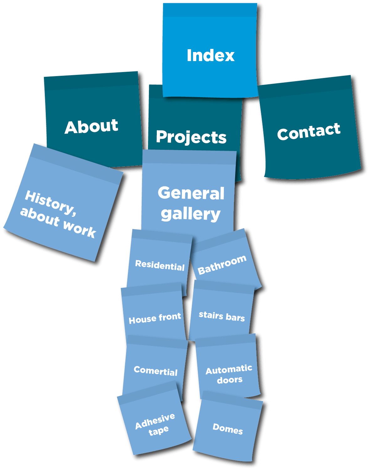
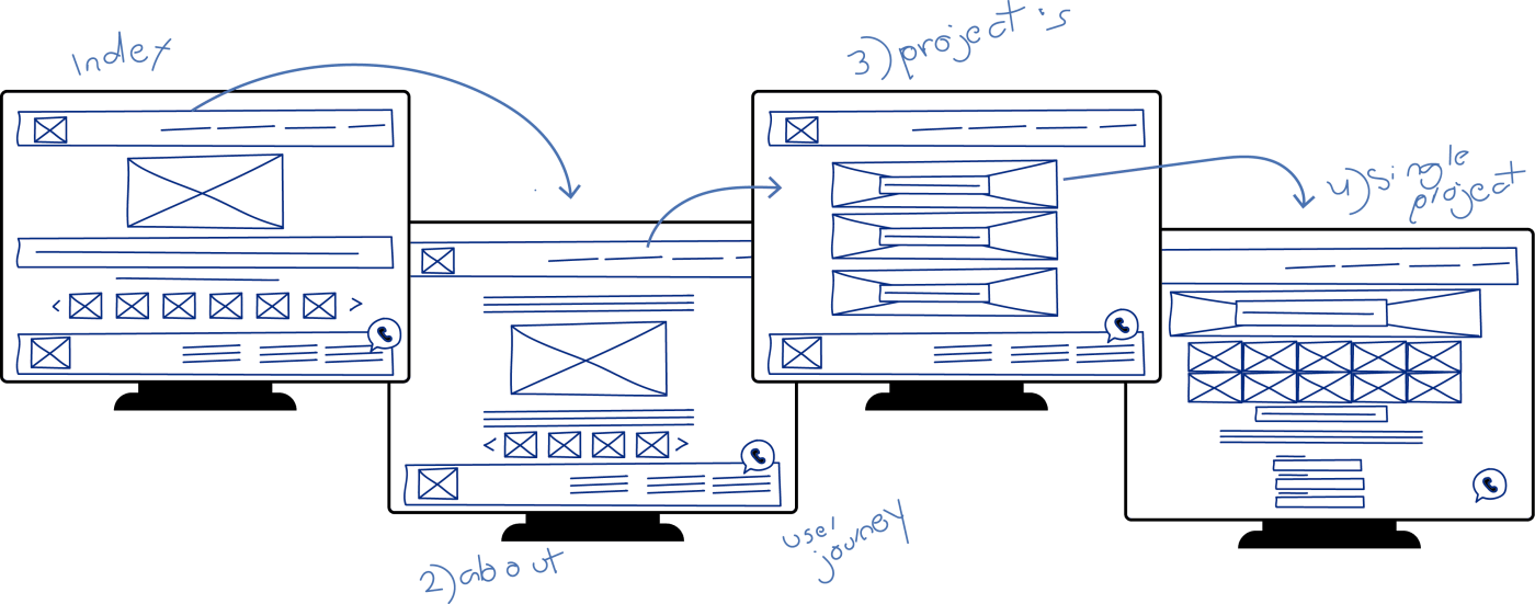
Following the brand graphic conceptual route, the initial task for the site mapping consisted in determining the initial type of work the brand offers, and then subcategorizing the line of work each other has. The classic contact section aside and as an UI must, the whatsapp direct message CTA was a part of the initial sketching.
By John Smith posted July 20, 2016
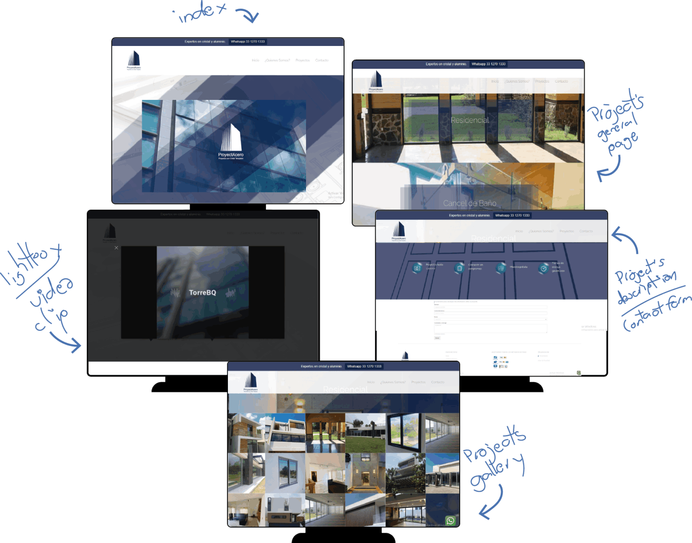
Some screenshots that allows a preview of the final website. Some color saturation on certain sections were required in order to generate a contrast compensation for example, in the icon description for each project.
