free website creation software

Arte Raiz
Logo + Website Design Review

What is
Arte Raíz?

Arte Raiz is a brand of luxury forniture and artisan makers from Acatlán de Juárez, Jalisco, dedicated to sustainability-first wood from the land the same artisans own. 

It comes from the word "arte" (art) and "raiz" (root).

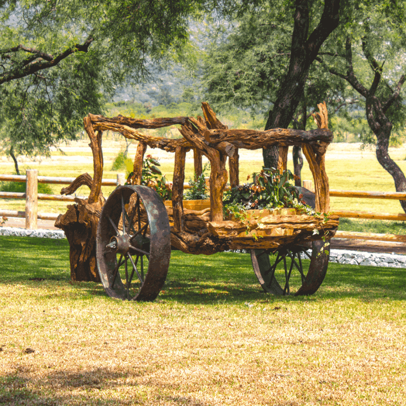
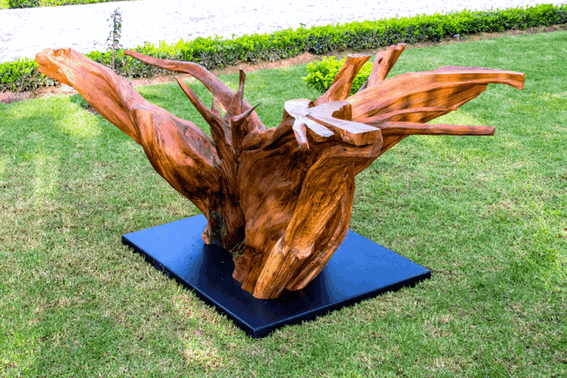
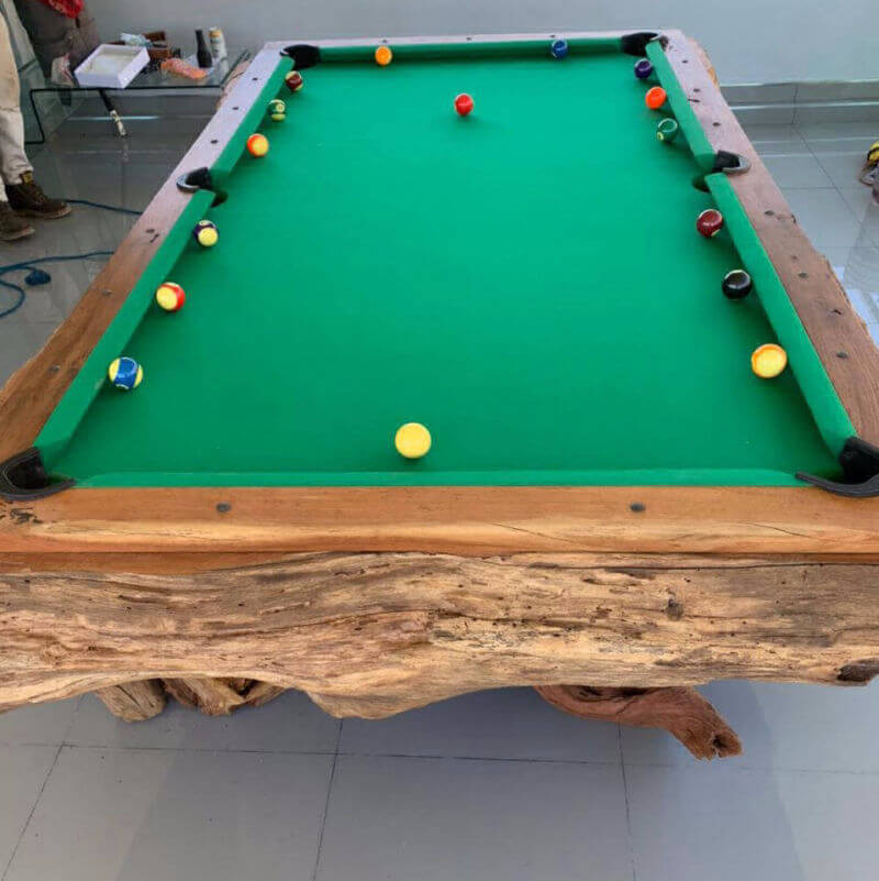
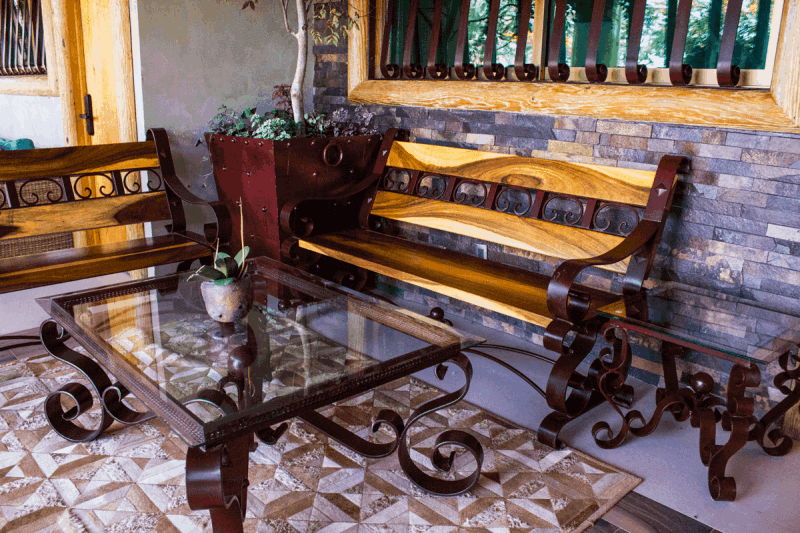
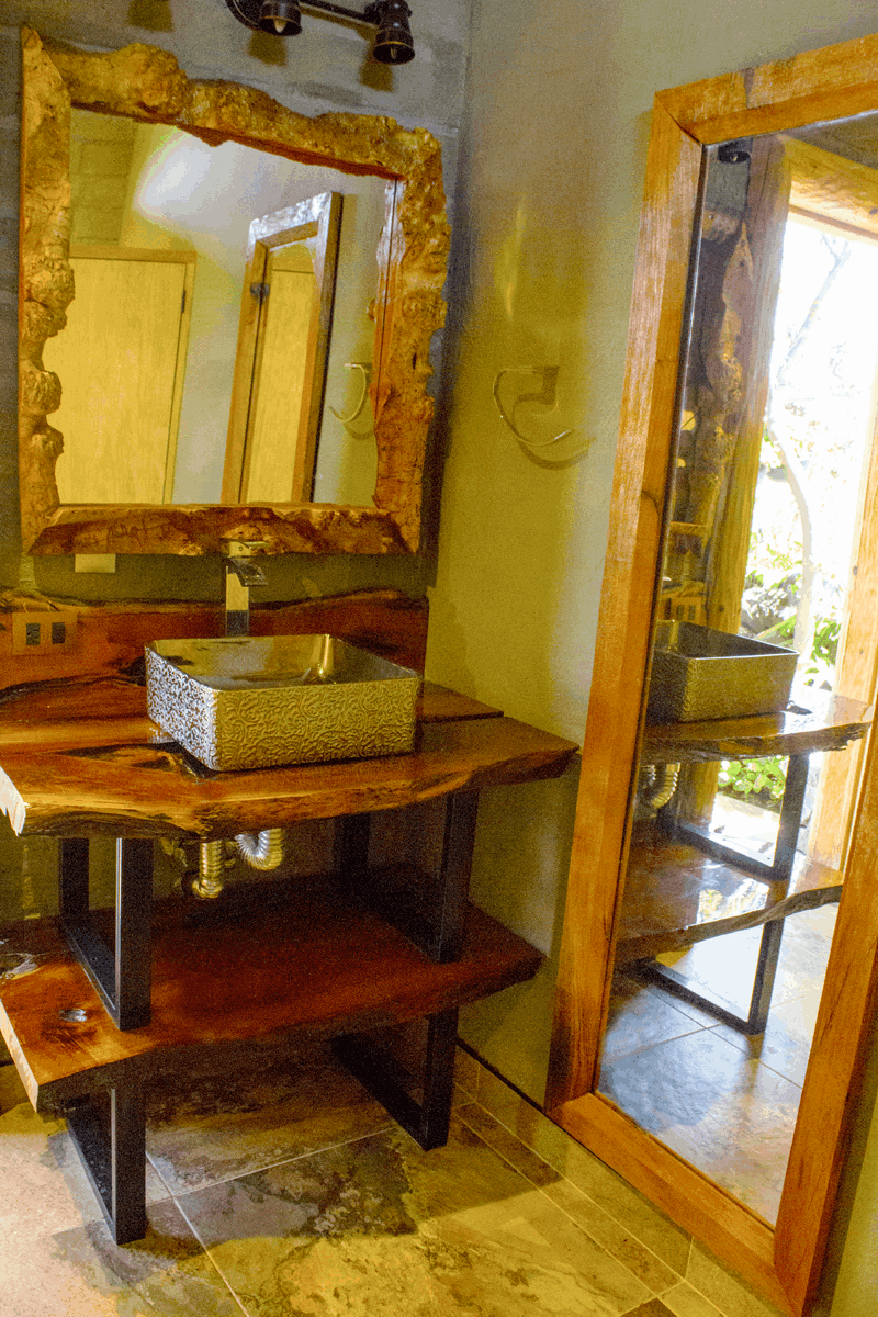
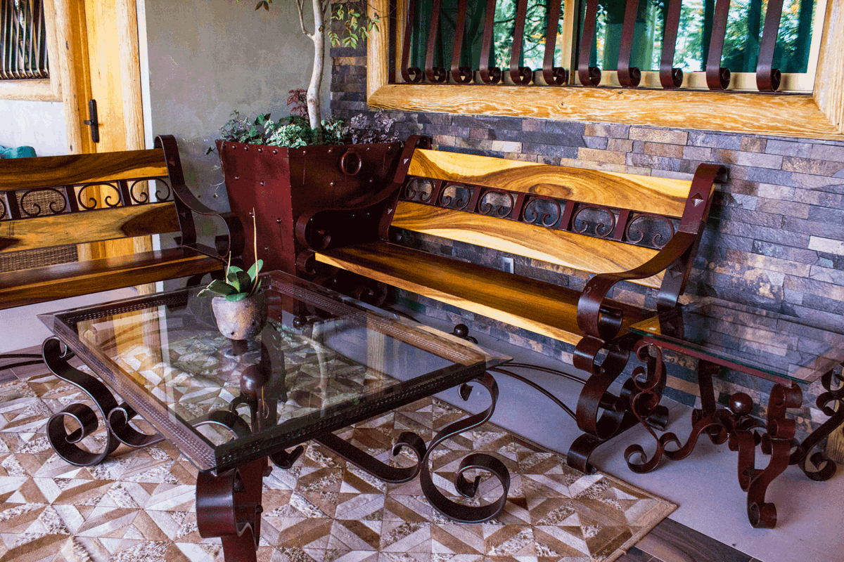
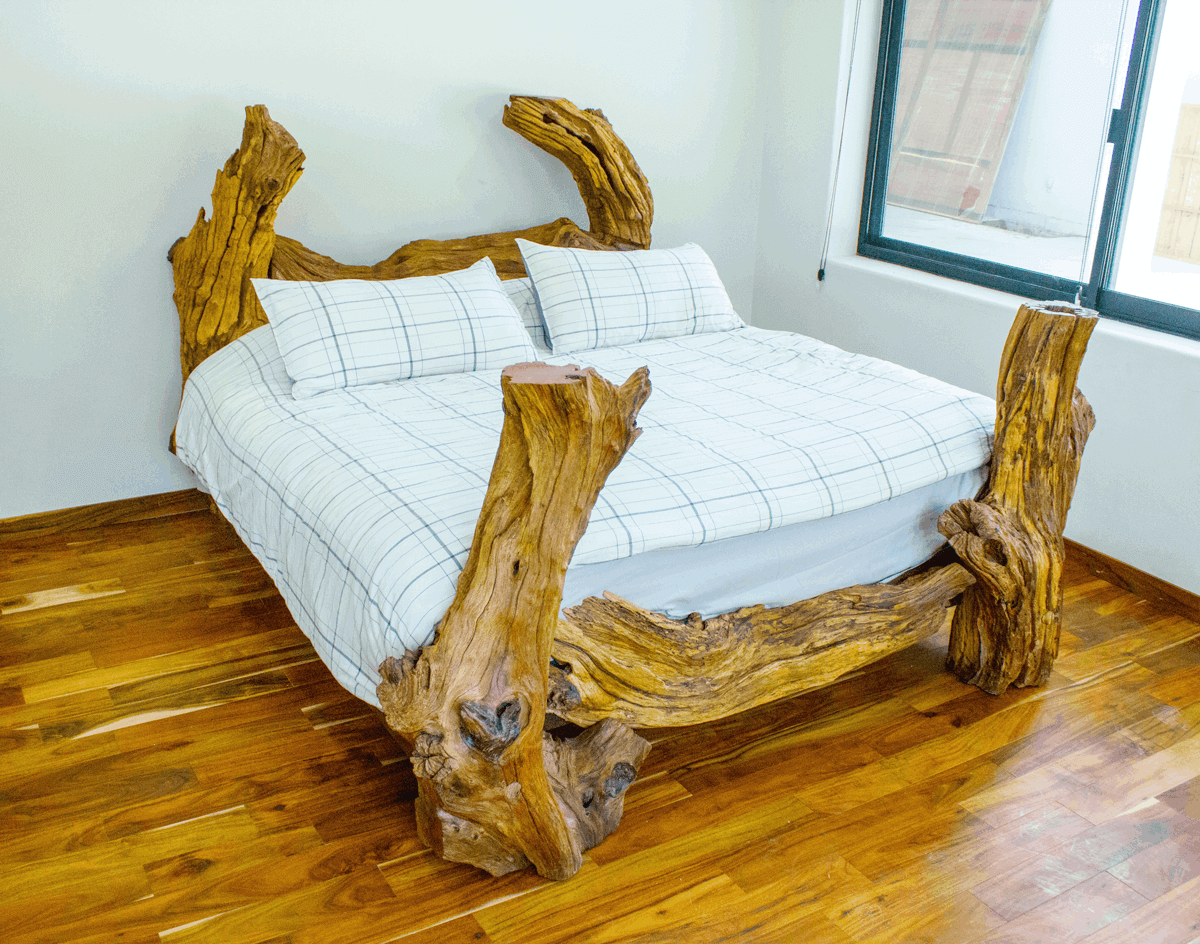
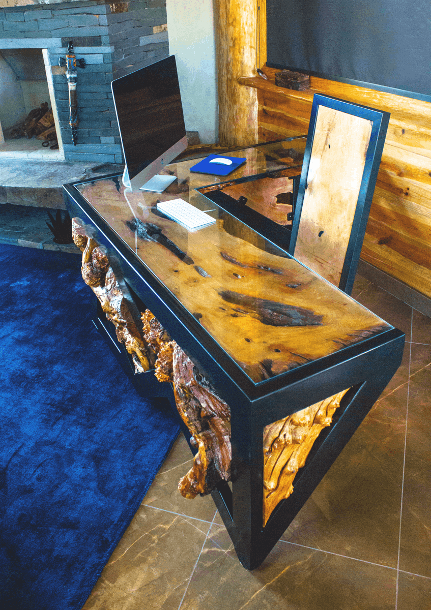
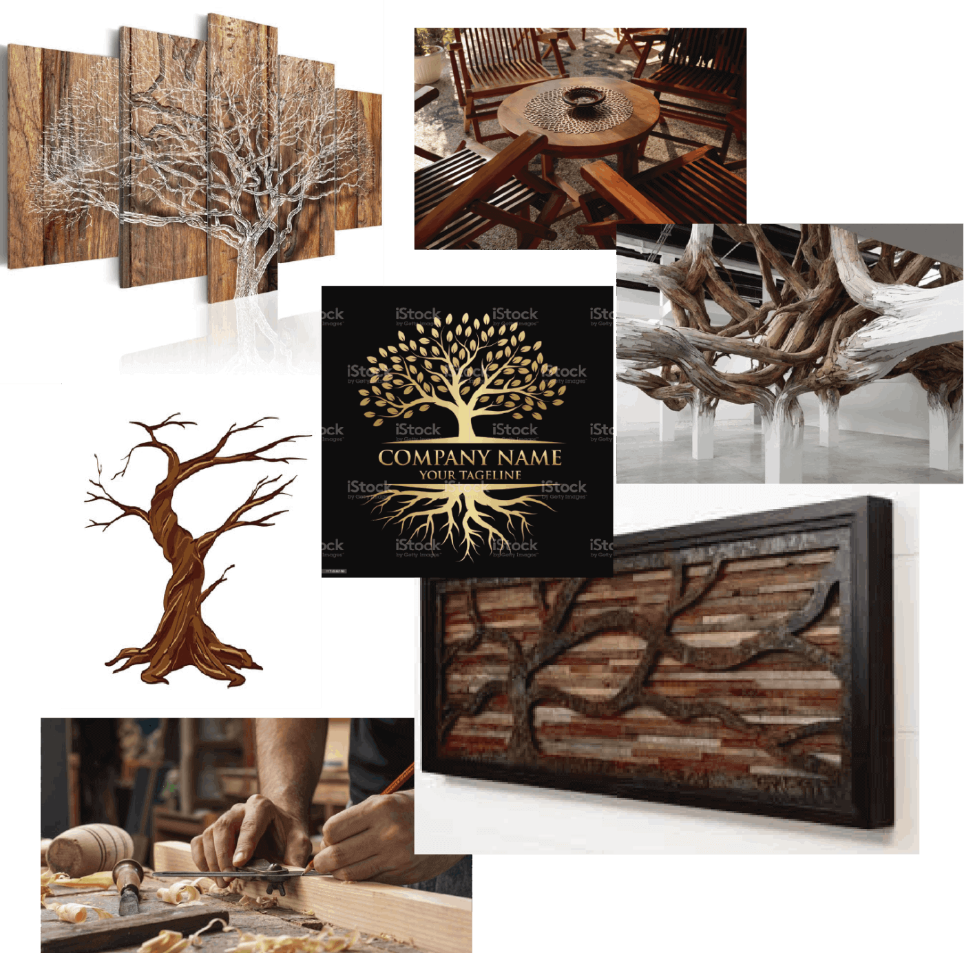
The fabrication process

It's pretty simple: A tree has a natural and official "death" (regulated from gubernamental laws to guarantee the suntainability of the prime matter), then the piece, along with all its branches, is located into guard. The piece is not cut in any way further because it has to be evaluated to know what kind of final usage its going to have. Afterwards, a process called "curing" the wood (that may take 1 year long!), taking care of the moisture and other procedures, the piece is placed into the workshop, where it is varnished, cut, polished and mounted for it to fit into the final form. So far, the artisans have produced several decoration and forniture pieces, from table bases, chairs, beds, etc.

Moodboard

Assets for inspiration into the brand making

Branding phase
How is it going to look like?

For the branding phase, it was intended to place a logo design that reflected the sustainable, artistic, luxury and minimalism of the brand.

It was intended to have an initial "english" name because of the foreign market Jalisco has, but in th eend it was decided to use a spanish title for the brand.

Final logo design

Final graphic solution for the logo was a mix between an "artisan-esque" typhography and solid and firm sans-serif (Bebas Neue). The top of the image comes along a dry tree silouethe repsenting the primary source for the artisans to work with. It is also framed inside a square to bring a context of decoration to the image itself.

The website project

The site mapping and wireframing of the website began before the final logotype version was refined, so it didnt had a negative impact on the time destined to portray the whole brand image into a sketch for the final site.

Site map

The sections for the website were determined by the clients main products, and the were intended to work as a gallery for potential buyers  to admire the work since the whole collection remains based in Acatláns origin.

Wireframing

The wireframe pahase include the desition to include images from products and textures form the wood employed to bring the potential costumer into the experience of having a glance at the authenticity of the materials offered.

Marketing and social media department brainstormed catch phrases to include into some sections of the index in order to bring emphasis into the artisan work.

Final display solution

The whole site finally reached a color usage less black and client opted to mantain a more gray and white space into the different sections. The images had little to none intervention and the text was shortened in the extention with the end of making a more "image-consuming" interface. 

See the finished project here