It was around late 2012 when i was collaborating for Uruapan Chamber of Commerce as my first job ever after graduation, and, as many influential connections with gubernamental partners are made in that place, it was my designation as the designer in charge of crafing the tourism brand for Uruapan (this is also my birthplace).
In Michoacán you can taste the different flavors of our varied gastronomy, you can also see the beautiful landscapes, we are a state with all kinds of climates; In Michoacán, in November you will be able to reunite with your loved ones with our ancestral celebration for the day of the dead, you will see later how the monarch butterflies begin to arrive at their sanctuaries, we are Purépechas, ready to conquer you with your visit.
I met the designer in charge of the original graphic structure for Michoacán trough a personal meeting at Morelia (Michoacan's capital, better known as the soul of Mexico for all its richness in different areas) and had a briefg on how the brand should become as a sibling for the main design.
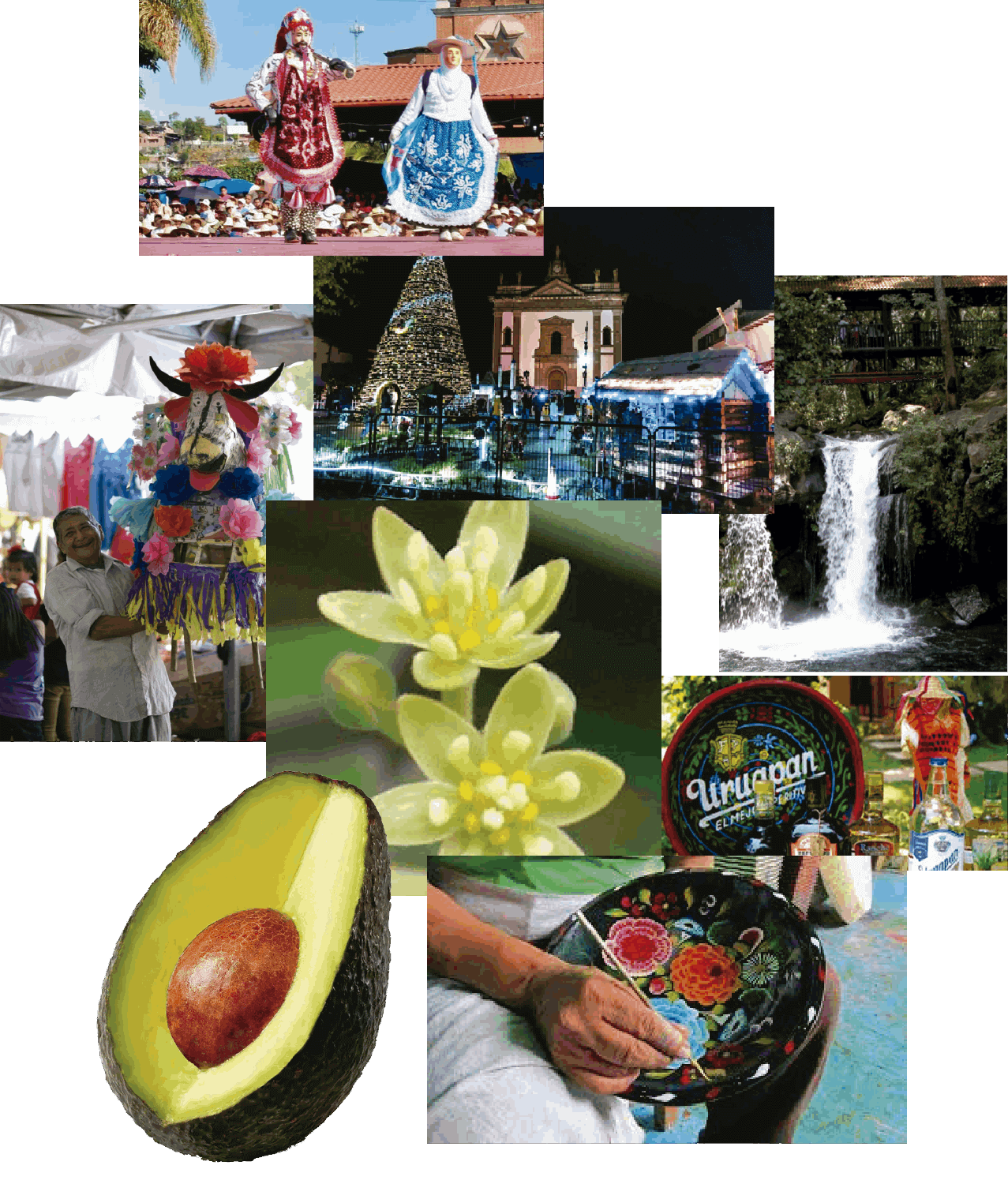
The current logo has a mix of the Monarch butterfly that year with year has their mating season in a secured aréa known as "monarch butterfly sanctuary", and the architectural style Morelia has from the cantera, a colonial-age building material found in many iconic places around the region.

--------------------

There were many things to consider into the develepment for the final graphic brand, from the color to be employed, to the artistic representations to be included and the tagline combining the mix. Uruapan is a small city of about 350,000 habitants, and its known for the production of one of the best worldwide importation avocado.
The existence of the 9 "barrios" (main neighborhoods or local areas), the "maque" a prehispanic artisan decoration method, and the avocado's flower were the main themes to complete the conceptual and visual elements to conform the final brand.
After many sketches and refining graphic proposals, the final image for the logotype came as seen next.

The plan to set in motion the brand new tourism strategy started off. The first assignment was to invite the afiliated partenrs to the chamber and ask them to participate in the following marketing options in order to impulse the brand.
A tourist guide for the most famous and traditional places from Uruapan, including the locations and information about such places and the participant bussinesses located on a map was the best placed option to develop a way for outsiders to know more about Uruapan.

The Michoacán tourism Administration had developed a year previous folded guide with information about notorious points of interest, routes, service, restaurants and detailed information for any tourist to acknowledge places they'd be interested in a certain situation.
It was designed in a modular scheme and each square of the composition included different information contained in a different color, designed previously from the main logo.
Different assets are to be incluided in the different display areas of information. From icons that can identify a certain area or service, to the design that is to be included on the map.
The final proposal was delivered on a first edition on April 2012 for the period of "semana Santa", wich is a two week span where Uruapan has the year's most tourism afluence. It has descriptions from many nearby towns and interesting places, and, in the comercial side, the map includes local businesses pointed in different categories, such as restaurants, service stations, points of interest and recreational activities.


For the 2022 version of the guide, it was conducted a research into finding the best option for bringing a digital interface to display the information.